Aortal & Floral: When Type Goes Goth

This isn't Jessica Hische's expressive typography. (Disclaimer: I would cut off both of my hands to be as talented as Ms. Hische ... if I didn't need them to draw letterforms with!)
I didn't expect to spill my blood and guts for the sake of this project, but I suppose I have not lost the ability to surprise myself. The assignment: pick a phrase from a song, poem, or adage that lends itself well to representation in visual form. After scouring my entire Google Play music library, all of my books that are not currently in storage, and picking the brains of my most literary compatriots, I settled for one of the first set of words I'd jotted down:
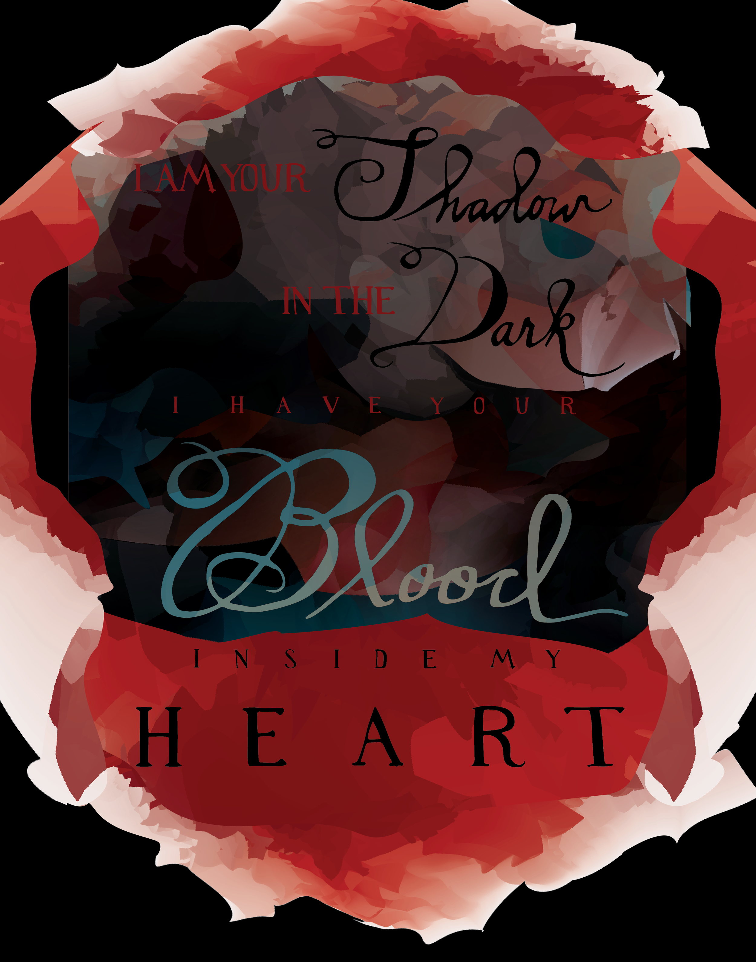
I am your shadow in the dark / I have your blood inside my heart.
These lyrics come from the decidedly un-goth band Spoon, whose song, "Me and the Bean," is perhaps one of the best musical creations of all time. (In fact, the lyrics for the entire song are as crazy-gorgeous as the two lines I pulled out.) So yes, there are a few visual handholds here: shadow, dark, blood, and heart. Nothing too crazy though. Right?
While nearly everyone else in my class was working their hardest to imitate chalkboard typography (with a few notable exceptions), I racked my brain to think of a style that would capture the essence of the lyrics in a totally unexpected, zero-percent-hackneyed type of way. Still in music-mind, I thought of the incredible work of Decemberists album artist Carson Ellis, whose naive, slightly awkward letterforms let the humanity of their creator show through with a brilliance only a true expert could possess.
Hand-drawing letterforms is not easy.
I thought I could pick up a calligraphy pen and bust out some beautiful words. I thought, after trying that, that I could draw their outlines in pen and fill them in. Nope. Not right either. In the end, I wrote every single letter you see in my finished product individually, over and over and over again. I circled the pretty ones. I scanned them. I vectorized them. And then I cleaned them up just enough to look pretty, while leaving the hand-drawn effect as much intact as possible. (Why bother to do it all by hand otherwise?)
Now comes the fun part: The background.
As I wrote on Behance, "The gushing, abstract background is a series of gradient meshes layered atop one another to appear simultaneously aortal and floral."
Indeed, I basically nuked the fancy school computer with an anchor-point army of gradient meshes, LOSING ALL MY WORK IN THE PROCESS, and having to start my bloody background again from scratch. (In the end, no computers were harmed in the making of this poster. Only slightly vexed.) What you see are several flat versions of the same gradient mesh layered, trimmed, and blended with one another into a complete (ahem, *bloody*) mess!
Lesson learned from this project: Maybe if I read Hische's book on repeat, practice regularly with my new analog nib and ink pen for the next 5 years, and strive my hardest, I'll one day be able to bust out letters half as beautiful as Carson Ellis's. Maybe.